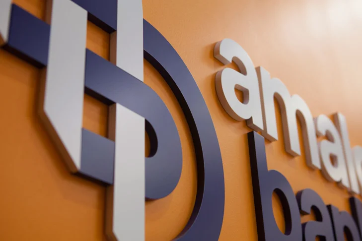
While at Pentagram, I had the opportunity to work closely with Michael Bierut and Hamish Smyth to develop a new brand identity system for NYC's-own, Amalgamated Bank. Established in 1923, Amalgamated is the leading financial institution dedicated to providing affordable banking services to working people, unions, and progressive organizations and businesses.
From the Penta-blog:
Amalgamated has its roots in the union Amalgamated Clothing Workers of America, now part of Workers United, current majority owner of the bank. The bank’s heritage in the garment manufacturing union inspired the new mark, which weaves two forms together like fabric and resembles an abstract “A” and “B.”
The mark is woven from two folded loops, suggesting strength and unity, good traits for a bank. (The definition of amalgamate is “combine or unite to form one organization or structure.”) The shape functions both as a monogram—it updates an existing “AB” configuration—and a memorable symbol that graphically illustrates the bank’s emphasis on community and working together.
For the 2013 Annual Report of the Flatiron 23rd Street Partnership, the area Business Improvement District, Michael Bierut, Britt Cobb and myself sent photographer Luca Vignelli to the top of the Flatiron for an aerial shot of the District from a rare perspective.
Titled “View from 285 Feet,” the height of the Flatiron Building, the annual report unfolds to reveal the intersection of Broadway, Fifth Avenue and 23rd Street looking north toward Midtown, with the green of Madison Square Park to the east.
Playing off the title, the report’s neighborhood statistics have been overlaid on the photograph to create a large infographic of the area.
While interning at Pentagram I had the opportunity to help design the logo for WalkNYC, a new wayfinding project by the New York Department of Transportation. Along with that, I contributed various illustrations of New York landmarks for the signage itself.
For more information about the wayfinding system, you can read up on the Pentagram blog.
Design credit for the complete project goes to Michael Bierut, Hamish Smyth, Tracey Cameron and Jesse Reed.
During my internship at Pentagram, I had the distinct honor of designing the new flag at 204 Fifth Ave.
Party in the front, party in the back. Red, white and black.
Designed with Michael Bierut.
Washingtonians go-to for health coaching, personal training, group training, sports-specific training and corporate health programs.
Work completed with Oliver Munday Group.
Aaron Michalovic is a trained timber framer from his home state of Maine. He can build a barn that will last 200 years without using nails or carve a beautiful spoon out of a branch. Watching him work encourages you to do what you love–the right way.
Made while working with Arts & Rec.
Preliminary identity system for friend and metal artisan, Kevin Retherford. This kit was designed with a limited budget in mind, so rubber stamps were manufactured to cut production costs, along with adding an appropriate amount of grit to the design.
My Senior Thesis project for St. Edward's University.
Branding, printmaking, sign-painting and beers.
Photos by Kelsey Mah Smith.
Oliver Munday had the amazing opportunity to design and direct the Spring 2013 issue of GOOD Magazine, their annual "GOOD 100." Thanks to my pal, John Custer, I was able to jump on board for this project. My role comprised mostly of the design and layout of the feature article, the '100,' although I did manage to sneak in a few illustrations, to boot.
We took inspiration from the GOOD 100 and the people/ideas that were being featured: encourage the reader to take action, to become engaged in their community, to 'Go Do.'
We also gave a serious nod to Rube Goldberg and his incredible machines. His gadgets are scattered throughout the issue, in all their complex and indirect glory.
Killed directions for HUGE Inc.'s stand-alone site, offering their line of tote bags and other gags.
Completed while at HUGE Inc.
My contribution to Hurricane Sandy relief fund, Print Aid NYC.
For more details, click the mouse here.
I recently competed in this goofy design competition, Pixels of Fury: NYC. We had twenty minutes to make an "inspiring or call-to-action" themed poster, using assets provided by Shutterstock.
The event took place just a few days after Lou Reed had passed, so I chose to give his legacy a little nod.
From a quick drawing on my finger, to snapping a picture of it with my phone, to a banana. Sorry for all the links...
2-color screenprint "call for submissions" for St. Edward's annual student literary and creative arts journal, Sorin Oak Review.